https://jamesk185.github.io/James-Kowalik-Portfolio/
Project 1: Pitchfork Scores Data Analysis and Prediction
An independent data science project by James Kowalik completed in October 2021.
Link to report: https://rpubs.com/jamesk185/824113
Overview:
- Written and programmed in R.
- Data processing and cleaning.
- Writing functions and building new variables, predictors.
- Data analysis.
- Using machine learning to perform prediction.
Background:
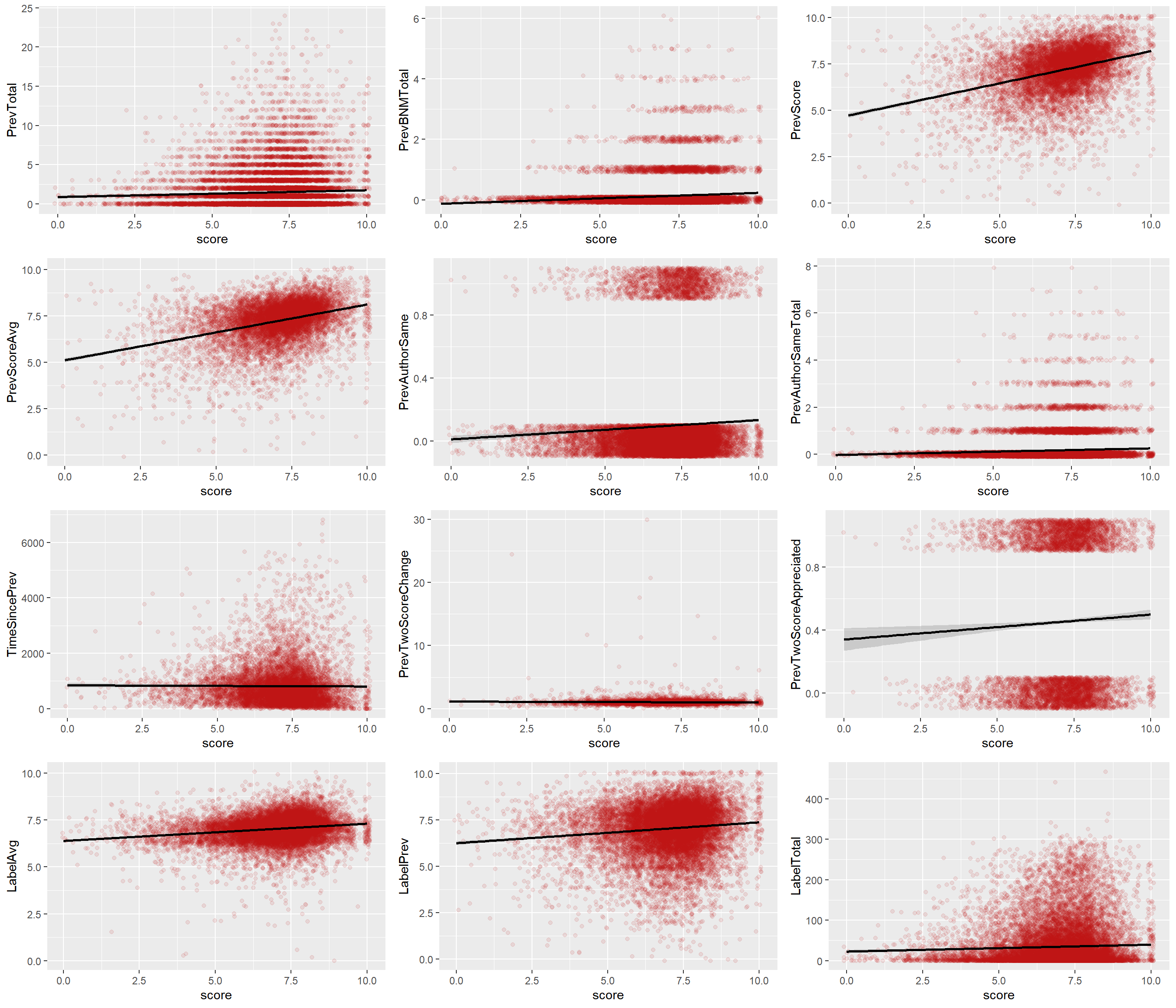
Pitchfork is one of the most widely read online music magazines. It is most famed for its album review scores and ‘Best New Music’ award system. It assigns a score from 0 to 10 to one decimal place for an album that is released and reviewed by one of their writers. An album which receives a score of higher than 8.0 will often receive ‘Best New Music’ status- an indicator that it is of particularly high quality and an award which holds a lot of influence in terms of the album’s sales and credibility.
The aim of this project will be to explore a dataset of Pitchfork reviews and, ultimately, build a prediction model that attempts to predict the score an album will get when reviewed by Pitchfork.
The below image is taken from the data analysis stage (and the report) and shows correlation between the predictors I built and the score.
Project 2: Vizualisation of Climate Data Recorded in Chiyoda, Japan
A data science project completed as part of the Applied Plotting, Charting & Data Representation in Python course by University of Michigan. Completed in December 2021.
Link to Report : https://github.com/jamesk185/Vizualisation-of-Climate-Data-Recorded-in-Chiyoda-Tokyo-Japan-Python-/blob/main/Report.md
Link to Graphic : https://github.com/jamesk185/Vizualisation-of-Climate-Data-Recorded-in-Chiyoda-Tokyo-Japan-Python-/blob/main/Graph.png
Overview:
- Written and programmed with Python using Jupyter Notebook.
- Data processing and cleaning.
- Data visualization.
Background:
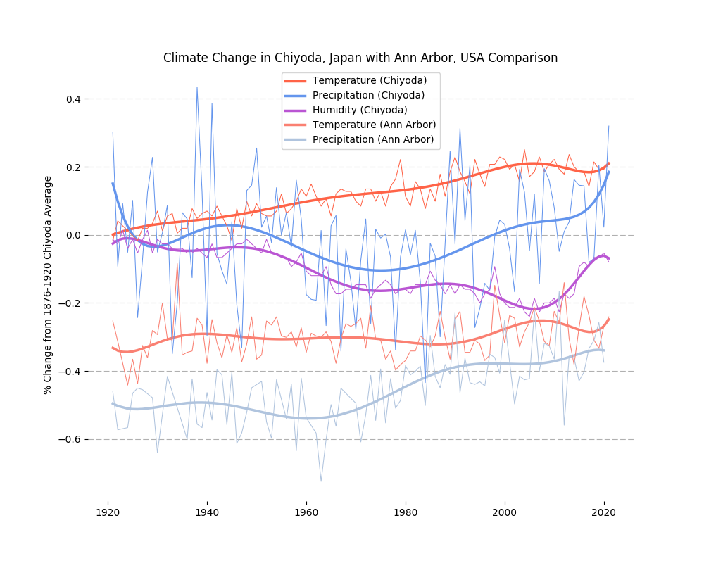
How have air temperature, total precipitation and relative humidity changed in Chiyoda, Japan over the last century and how do they compare to Michigan, USA?
With the primary focus being on Chiyoda, Tokyo, I will take a broad look at changes in climate condition over the last century in three key areas; air temperature, precipitation and humidity. For means of comparison and further interesting insight, and with the course being conducted by University of Michigan, I will include the air temperature and precipitation data for Ann Arbor, Michigan.
Below is the final produced graphic.
Project 3: Next Word Predictor App
Completed as part of the Data Science Capstone course in the Johns Hopkins University Data Science Specialization in October 2021.
Link to pitch presentation: https://rpubs.com/jamesk185/819061
Link to shiny app: https://jamesk185.shinyapps.io/WordPredictor/
Overview:
- Written and programmed in R.
- Natural language processing and tokenization.
- Creating an application using R’s shinyapps.
Background:
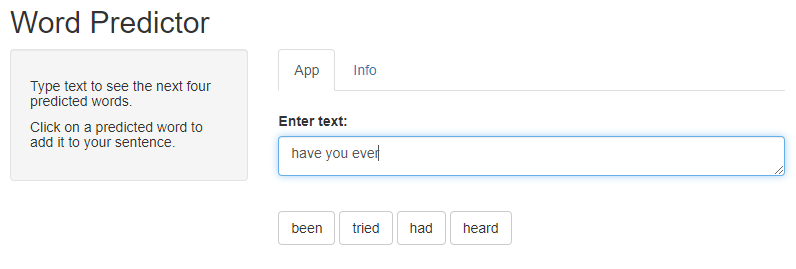
The aim of this project was to create an application that allows use of a predictive text model. With my app, a user will type a sentence, and the app will predict the next word in the sentence for them. My app will provide 4 options for the user where clicking on one of them will add it to the input box.
This was achieved through analysis of text data and natural language processing. In this process, tokenization was used to create datasets of ‘n-gram’ word combinations. With this, I tried various methods that looked at ultimately finding the best efficiency of the final product. That is to say, increasing the ‘n’ in ‘n-grams’ to have word combinations of, say, 8 words, would absolutely improve the accuracy of a word prediction model but the code would most likely not run in a reasonable timeframe on most computers. Also, the speed of the final product output from the app’s user’s perspective must be considered in this efficiency.
Below is a screenshot of the app’s interface.
Project 4: Understanding and Predicting Property Maintenance Fines
A data science project completed as part of the Applied Machine Learning course by University of Michigan. Completed in February 2022.
Link to report : https://github.com/jamesk185/Understanding-and-Predicting-Property-Maintenance-Fines-machine-learning-Python/blob/main/Report.md
Overview:
- Written and programmed with Python using Jupyter Notebook.
- Data processing and variable manipulation.
- Machine learning with prediction algorithms.
Background:
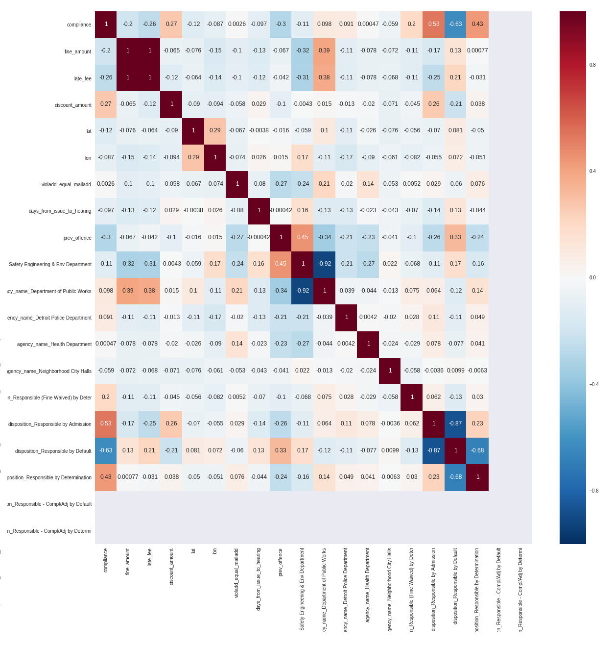
The Michigan Data Science Team (MDST) and the Michigan Student Symposium for Interdisciplinary Statistical Sciences (MSSISS) have partnered with the City of Detroit to help solve one of the most pressing problems facing Detroit - blight. Blight violations are issued by the city to individuals who allow their properties to remain in a deteriorated condition. Every year, the city of Detroit issues millions of dollars in fines to residents and every year, many of these fines remain unpaid. Enforcing unpaid blight fines is a costly and tedious process, so the city wants to know: how can we increase blight ticket compliance?
In this assignment I will use predictive modelling to predict whether a given blight ticket will be paid on time. My predictions will be given as the probability that the corresponding blight ticket will be paid on time and the evaluation metric which will be used is the Area Under the ROC Curve (AUC).
Below is a figure taken from the report showing the correlation between all of the final set of variables that were to be used in the prediction model.
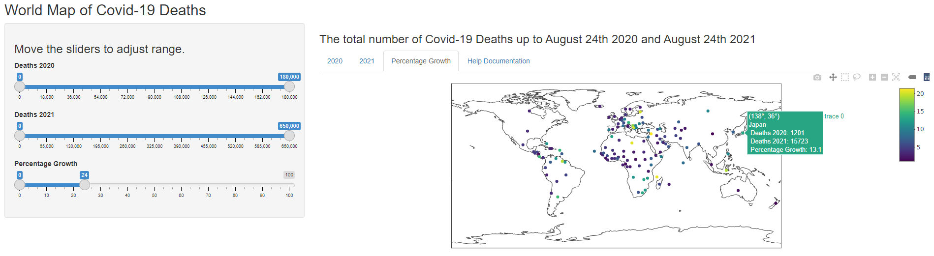
Project 5: Interactive Mapping of Covid-19 Deaths
Completed as part of the Developing Data Products course in the Data Science Specialization by Johns Hopkins University in September 2021.
Link to shiny app: https://jamesk185.shinyapps.io/ddpCourseProject/
Link to presentation: https://rpubs.com/jamesk185/805644
Overview:
- Written and programmed in R.
- Data processing and cleaning.
- Creating an application using R’s plotly and shinyapps.
Background:
The instructions for this project were as follows. “First, you will create a Shiny application and deploy it on Rstudio’s servers. Second, you will use Slidify or Rstudio Presenter to prepare a reproducible pitch presentation about your application.”
My project is about the Covid-19 pandemic. As we approach a year and a half since the disease began to impact societies greatly all over the world, using maps created in plotly, I aim to provide a means for comparison between Covid-19 deaths in 2020 and in 2021. The user of my application will be able to see things such as which countries may have been largely unaffected by the initial outbreak but suffered from a huge relative increase in deaths as the virus spread further and wider. There will be 3 maps; the total number of deaths up until August 24th 2020, the total number of deaths up until August 24th 2021, and the percentage growth in deaths from August 24th 2020 to August 24th 2021.
The image below is a screenshot of the application in use.
Certificates from Courses
Applied Data Science with Python By University of Michigan
Completed April, 2022.
5 of 5 courses completed;
- Introduction to Data Science in Python
- Applied Plotting, Charting & Data Representation in Python
- Applied Machine Learning in Python
- Applied Text Mining in Python
- Applied Social Network Analysis in Python
Data Science By Johns Hopkins University
Completed October, 2021.
10 of 10 courses completed;
- Reproducible Research
- Getting and Cleaning Data
- Developing Data Products
- Exploratory Data Analysis
- R Programming
- The Data Scientist’s Toolbox
- Regression Models
- Data Science Capstone
- Practical Machine Learning
- Statistical Inference
Learn SQL Basics for Data Science Specialization By University of California Davis
2 of 4 courses completed;
- SQL for Data Science
- Data Wrangling, Analysis and AB Testing with SQL
Data Science Professional Certificate By HarvardX
7 of 9 courses completed;
- Data Science: R Basics
- Data Science: Visualization
- Data Science: Probability
- Data Science: Inference and Modeling
- Data Science: Productivity Tools
- Data Science: Wrangling
- Data Science: Linear Regression